This case study investigates the underlying issues faced by users of doctor consultation apps like Practo, MediBuddy, MFine, and Apollo 24/7. Based on extensive user feedback, the study identifies key pain points, conducts a Root Cause Analysis using the Fishbone Diagram and 5 Whys technique, and provides actionable recommendations to improve the user experience in digital healthcare platforms.
Doctor
Consultation Application
Problem Statement
We have an established system for doctor consultations in the healthcare system, which is gradually failing due to a few issues. There are several issues with the system's Dr concentration application, and the major villains are doctors. When analyzing system gaps, I initially looked at application feedback and discovered numerous aspects involved.Doctors are not answering video calls on time.
Appointments are scheduled without prior notification to patients. will adjust the appointment dates and times.
There is no message follow-up after or before the consultation.
In the existing application. The main issue with doctor category selections is that there are many people, such as 1000 doctors, and their users are confused about how to choose the best doctor, which increases cognitive load.
Goal:
My goal is to make AI-powered healthcare commonplace for everyone, not just sometimes but all the time. AI should be able to help people get basic medical care whenever they need it.
My role:
UX Researcher leading the Hi Doctor Consultation mobile application design.
Responsibilities:
Conducting research, storyboarding, paper and digital wireframing, usability studies, iterating on designs, making high-fidelity prototype
Tools
Figma, Miro, Optimal Workshop, Otter.ai, ChatGPT, G-suite
All ABout The user
User Research
I conducted user interviews with a few using Doctor consultation apps and visitors to explore their user need pain points, and behaviors based on their needs, and the overall app experience. Insights revealed a desire for quick, seamless booking a appointment, helping me design the app that prioritize convenience and enhance user satisfaction.
Pain points
Doctor Consultation:
A lot of confusion happened when the doctor was being scheduled in Doctor Consultation Booking.
Get medicine quickly.
Find the closest pharmacy and get the best deal.
Quick help form doctors
A situation demands that required immediate attention, but at that moment, the doctor was unavailable and the necessary resources were needed.
Personas
Personas were selected by conducting user research and identifying common pain points, that frustrate and block the user from getting what they need from a product.
User journery map
It is the series of experiences Carlos has as he achieve a specific goal. It was built on the his experience.
I developed a user journey map of user experience with the app to highlight potential pain points and identify areas for improvement.
Goal:
Choose a good Doctor Consultation nearby and select Doctor in an app in a fast and clear way

The project schematically
Starting the design
I created various diagrams and storyboards to clarify and analyze the app's information and architecture. Afterward, I sketched paper wireframes and then transitioned to digital wireframes, building a low-fidelity prototype to conduct initial usability studies with stakeholders.
App map
It's a structured scheme that outlines the pages and content hierarchy of the app.
Next step: creating the application map. My goal here was to make strategic information architecture decisions that would improve overall app navigation. The structure I chose was designed to make things simple and easy.

Paper Wireframes
They initially oriented on the basic structure of the homepage and highlight the intended function of each element.
Here I drew five different versions of how structure of information on a homepage might look like. Then I reviewed all the versions and combined them in the refined one. The goal was to explore different ideas with wireframes.

Usability studies
This is an examination of users and their needs, which adds realistic context to the design process.
First I conducted unmoderated usability studies with a few participants: they had to answer different questions about the app and share their observations while using the initial low-fi prototype. After getting the data, I analyzed it and synthesized the information obtained. Finally, I found themes and came up with several insights. The goal was to identify pain points that the user experiences with the app designs so the issues can be fixed before the final product launches.
Add initial screen:
In the beginning, before choosing a Doctor, it would be great to look through the whole app and learn everything about it.
Doctor search.
There are no Doctor search - it's necessary to select it on the doctor list page. .
asking to book
Select the doctor appoinment time then asking to book
the clear version:
Refining design
On this step, first I created a static, high-fidelity Doctor Consultation app design (keeping in mind all the conclusions from the previous phase of usability studies) that is a clear representation of a final product called design mockups. After that, I created a high-fidelity prototype of the app.
Mockups
These are a high fidelity design that represents a final product
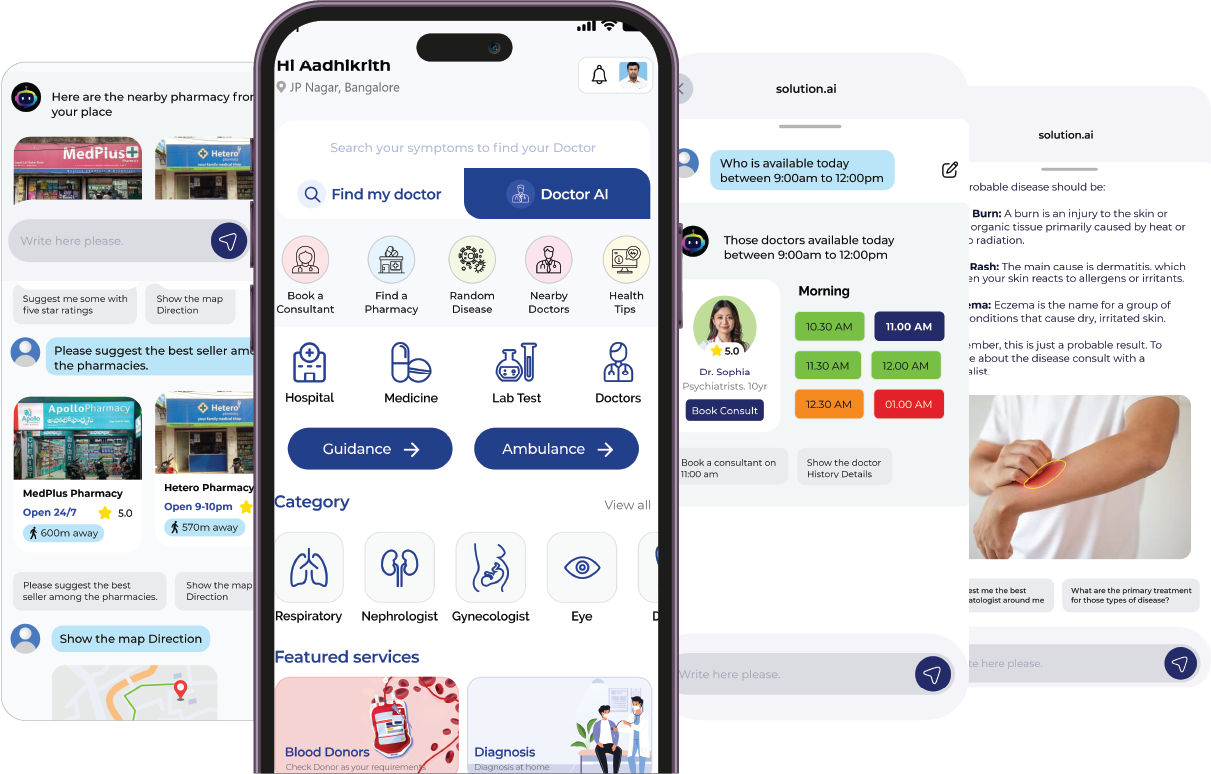
I created all the app pages mockups, incorporating the right design elements such as typography, color, and iconography. I also included captivating and visually appealing images, and developed all the necessary components and elements. The goal was to demonstrate the final Doctor Consultation app in as much detail as possible.
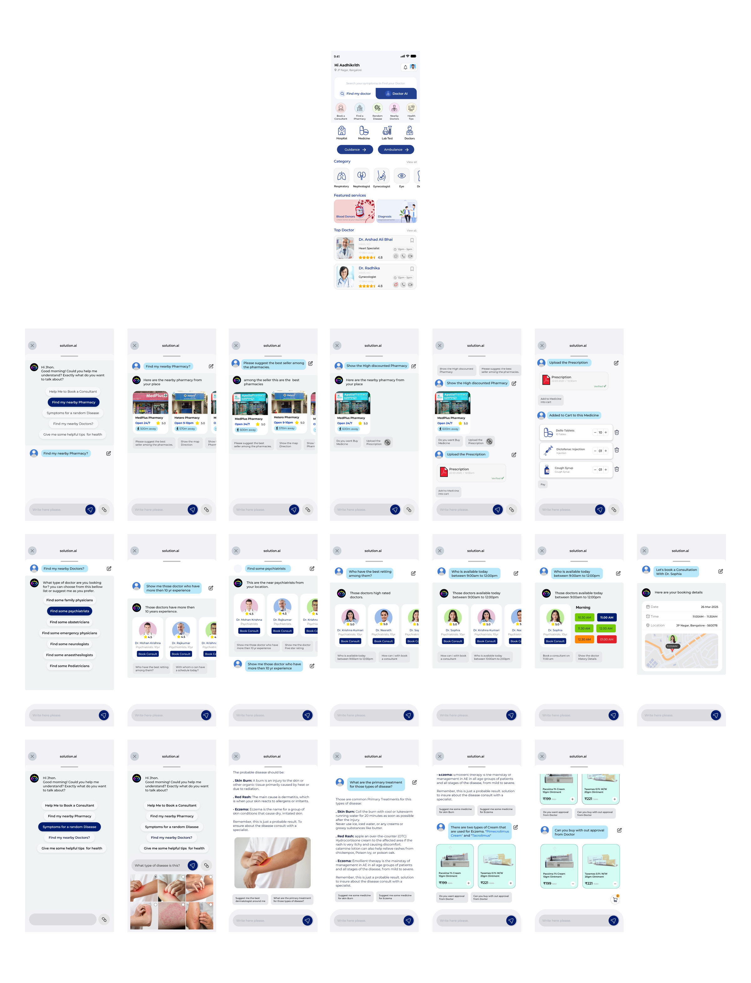
High-fidelity prototype
It's the detailed, interactive version of designs that closely match the look and feel of the final product.
I turned my mockups into a prototype that's ready for testing, using gestures and motion, which can help enrich the user experience and increase the usability of the app.
looking forward :
Outcome
Now, finally, it remained to pay attention to several takeaways and plan some further steps.
Takeaways
Impact:
Our target users have found Hidocotr App design to be intuitive, user-friendly, and easy to use: choose a right doctor in mint book a consultation, buy medicine and all they will get small thing solution
What I learned:
The key lesson I learned is that even minor changes can significantly impact the user experience. My biggest takeaway is to always prioritize the genuine needs of the user..