An Asset Management Application is a software solution designed to help organizations systematically track, manage, and optimize their assets throughout their lifecycle. These assets can include physical items like equipment, machinery, vehicles, and inventory, as well as intangible assets such as software licenses and intellectual property. The primary goal of such applications is to enhance productivity, prevent equipment failures, ensure compliance, and improve overall operational efficiency.
Assets
Management Application
Problem Statement
The current asset management application fails to align with the real-world workflows and cognitive needs of field users, leading to significant usability challenges. Users experience high cognitive load, difficulty navigating unclear task flows, and frequent confusion due to inconsistent UI patterns, vague terminology, and poor feedback mechanisms.Key asset-related tasks—such as verification, condition updates, and location transfers—are overly complex, requiring excessive manual input with little system guidance or validation. Mobile usability is particularly poor in field environments, with small tap targets, non-optimized forms, and no offline support. As a result, users struggle to complete routine tasks efficiently, leading to incomplete records, frequent errors, and reduced trust in the system.
To improve user satisfaction, data accuracy, and operational efficiency, a human-centered redesign is urgently needed—focusing on simplified workflows, contextual assistance, consistent navigation, responsive feedback, and mobile-first design principles.
Goal:
To design an intuitive, efficient, and intelligent Asset Management Application that empowers organizations to track, update, and optimize their physical and digital assets in real time—with minimal friction, zero guesswork, and maximum accountability—ultimately saving time, reducing operational costs, and elevating user confidence across teams.
My role:
UX Researcher leading the Hi Doctor Consultation mobile application design.
Responsibilities:
Conducting research, storyboarding, paper and digital wireframing, usability studies, iterating on designs, making high-fidelity prototype
Tools
Figma, Miro, Optimal Workshop, Otter.ai, ChatGPT, G-suite
All ABout The user
User Research
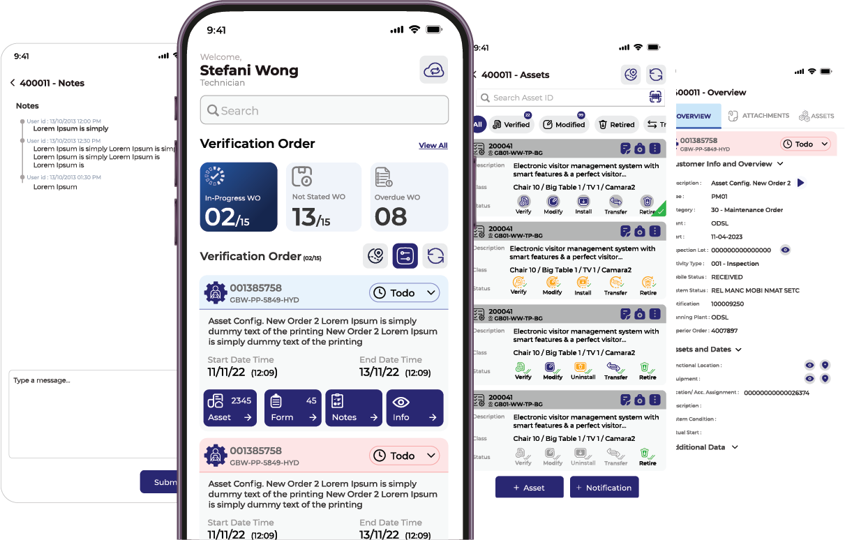
To understand the behaviors, needs, pain points, and mental models of users interacting with the asset management system—especially during asset verification, location updates, modification, Asset Retirement, Asset Transfer, Installation, and reporting—across mobile and desktop platforms.
Pain points
Confusing Navigation
Users often get lost in the interface and have no idea if a task is completed or saved.
Location Dropdowns Without Filtering
Selecting asset locations from a massive, ungrouped dropdown list wastes time and leads to errors.
Poor Mobile Usability in Field Conditions
Small tap targets, low contrast in sunlight, and form overload make mobile usage hard—especially in warehouses or outdoor environments.
Collect from Export Feed Back
Export information (Marketing teem feedback):
Identified UI & UX Issues:

Contextual Inquiry
Here's a deep-dive, of the Contextual Inquiry Research Report detailed version.

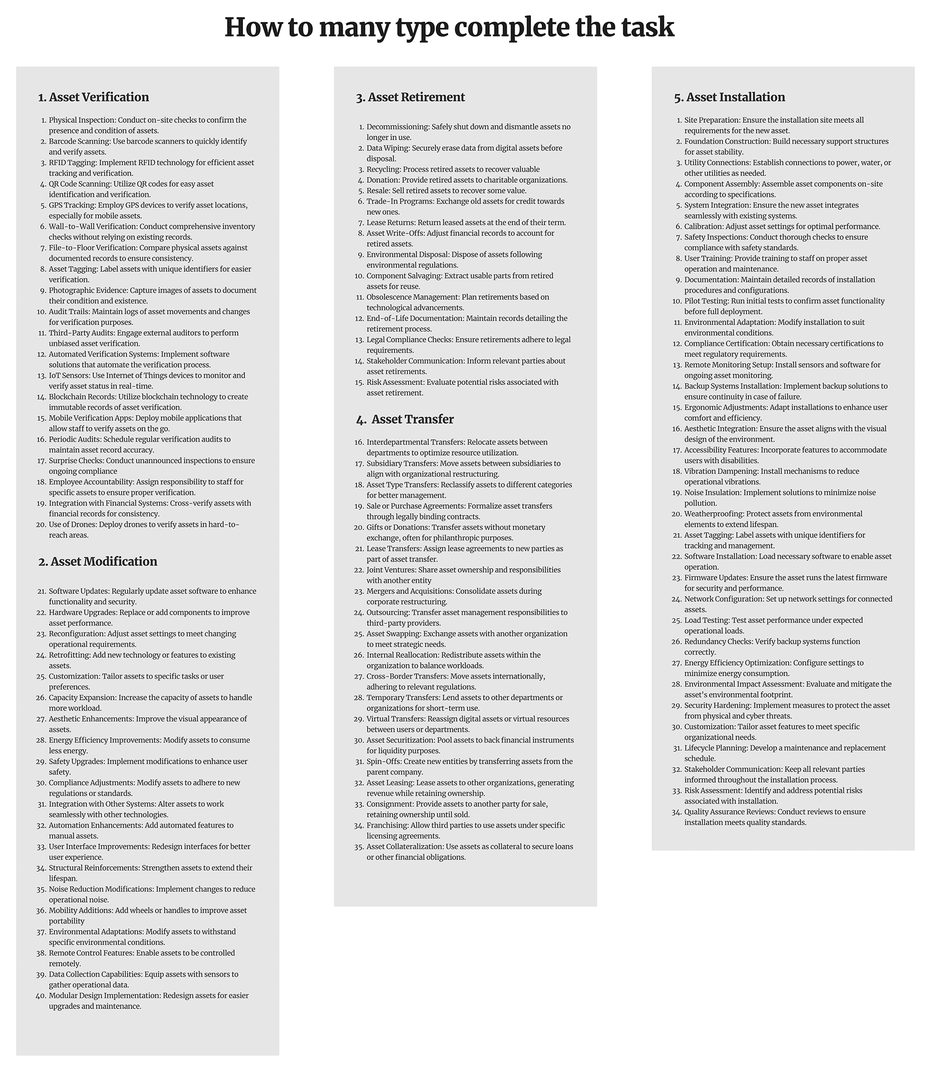
Type complete the task
List the different ways to complete regular tasks efficiently, Set timers.
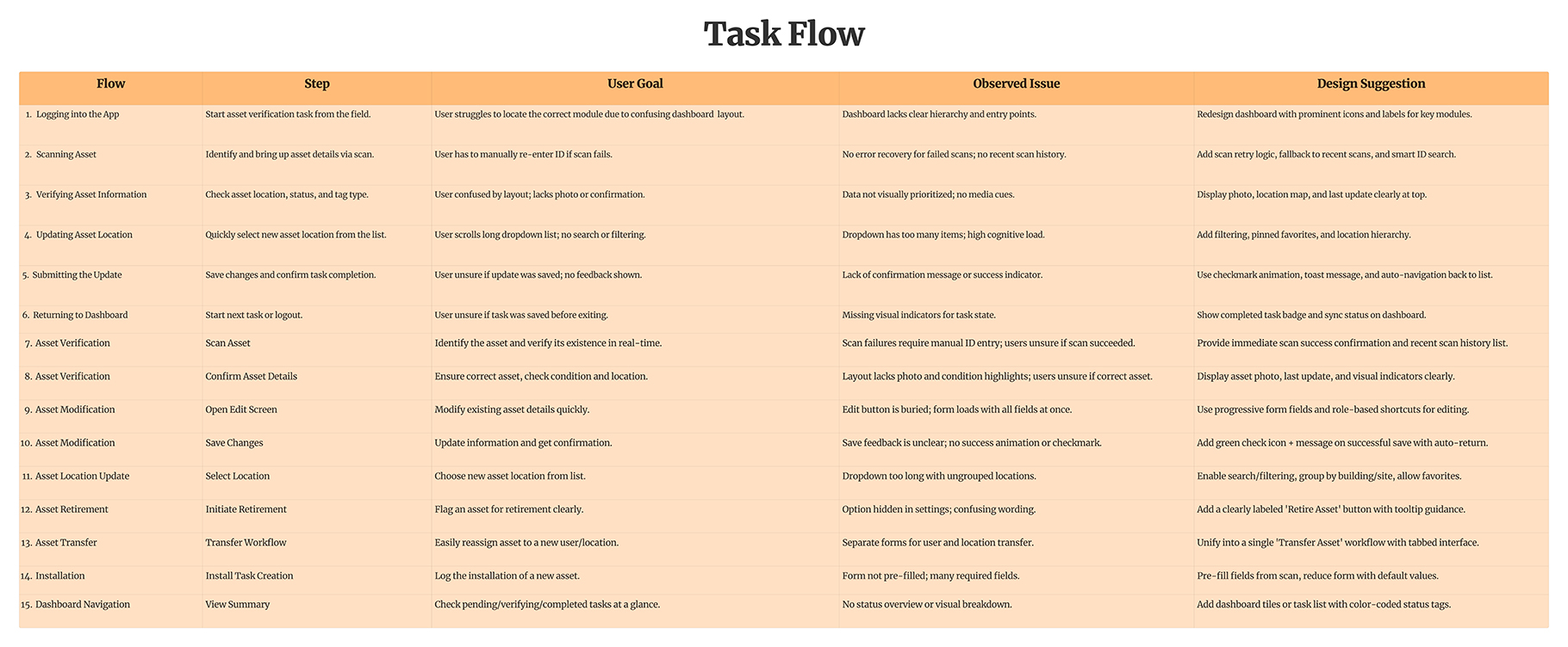
Task Flow
Story Board
I created various diagrams and storyboards to clarify and analyze the app's information and architecture. Afterward, I sketched paper wireframes and then transitioned to digital wireframes, building a low-fidelity prototype to conduct initial usability studies with stakeholders.
User journery map
It is the series of experiences Carlos has as he achieve a specific goal. It was built on the his experience.
I developed a user journey map of user experience with the app to highlight potential pain points and identify areas for improvement.
Goal:
Choose a good Doctor Consultation nearby and select Doctor in an app in a fast and clear way

The project schematically
Starting the design
I created various diagrams and storyboards to clarify and analyze the app's information and architecture. Afterward, I sketched paper wireframes and then transitioned to digital wireframes, building a low-fidelity prototype to conduct initial usability studies with stakeholders.
App map
It's a structured scheme that outlines the pages and content hierarchy of the app.
Next step: creating the application map. My goal here was to make strategic information architecture decisions that would improve overall app navigation. The structure I chose was designed to make things simple and easy.

Paper Wireframes
They initially oriented on the basic structure of the homepage and highlight the intended function of each element.
Here I drew five different versions of how structure of information on a homepage might look like. Then I reviewed all the versions and combined them in the refined one. The goal was to explore different ideas with wireframes.

Usability studies
This is an examination of users and their needs, which adds realistic context to the design process.
First I conducted unmoderated usability studies with a few participants: they had to answer different questions about the app and share their observations while using the initial low-fi prototype. After getting the data, I analyzed it and synthesized the information obtained. Finally, I found themes and came up with several insights. The goal was to identify pain points that the user experiences with the app designs so the issues can be fixed before the final product launches.
Add initial screen:
In the beginning, before choosing a Doctor, it would be great to look through the whole app and learn everything about it.
Doctor search.
There are no Doctor search - it's necessary to select it on the doctor list page. .
asking to book
Select the doctor appoinment time then asking to book
the clear version:
Refining design
On this step, first I created a static, high-fidelity Doctor Consultation app design (keeping in mind all the conclusions from the previous phase of usability studies) that is a clear representation of a final product called design mockups. After that, I created a high-fidelity prototype of the app.
Mockups
These are a high fidelity design that represents a final product
I created all the app pages mockups, incorporating the right design elements such as typography, color, and iconography. I also included captivating and visually appealing images, and developed all the necessary components and elements. The goal was to demonstrate the final Doctor Consultation app in as much detail as possible.
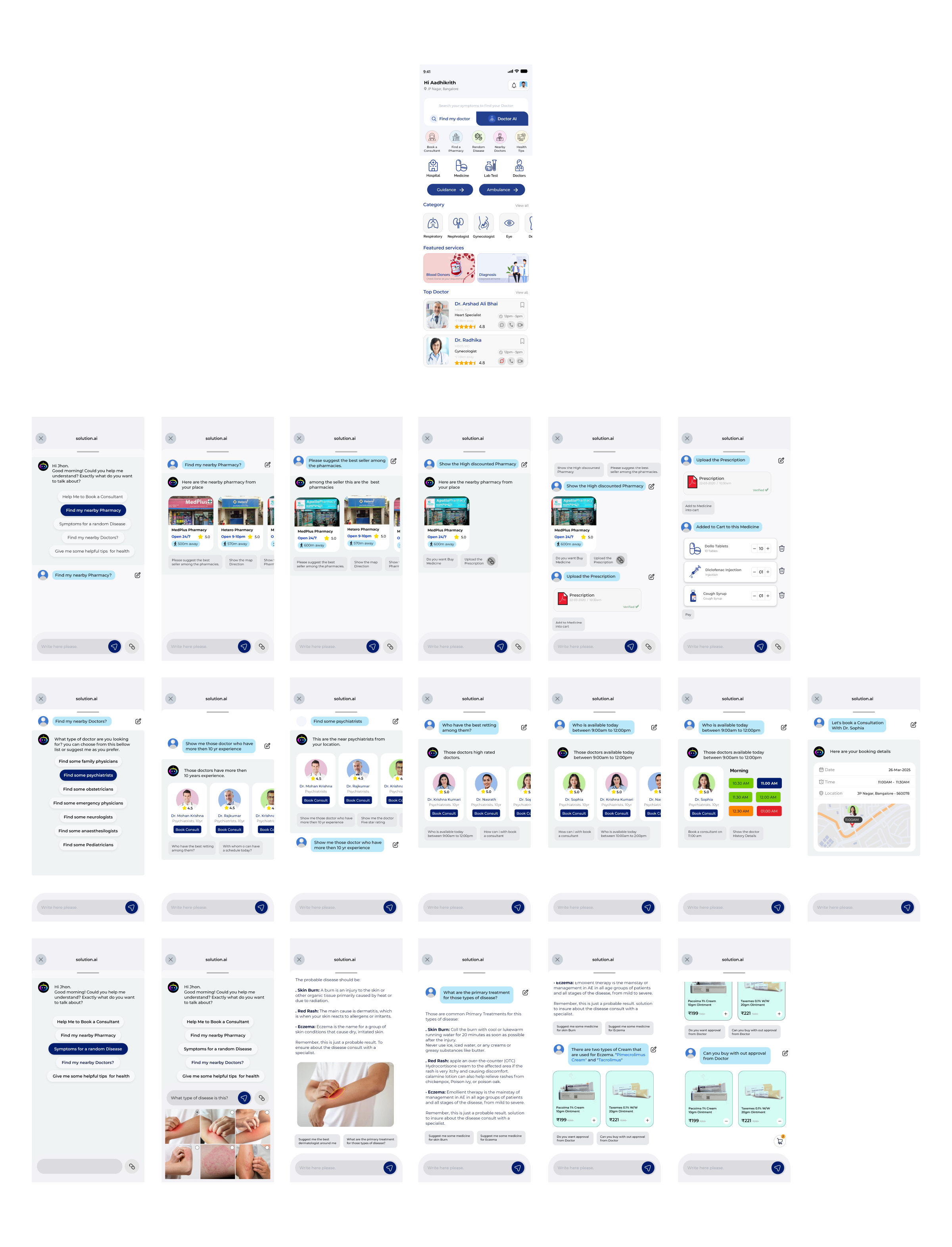
High-fidelity prototype
It's the detailed, interactive version of designs that closely match the look and feel of the final product.
I turned my mockups into a prototype that's ready for testing, using gestures and motion, which can help enrich the user experience and increase the usability of the app.
looking forward :
Outcome
Now, finally, it remained to pay attention to several takeaways and plan some further steps.
Takeaways
Impact:
Our target users have found Hidocotr App design to be intuitive, user-friendly, and easy to use: choose a right doctor in mint book a consultation, buy medicine and all they will get small thing solution
What I learned:
The key lesson I learned is that even minor changes can significantly impact the user experience. My biggest takeaway is to always prioritize the genuine needs of the user..